Chair's Message: Introducing our new name and logo
March 3, 2016
By Tim Manning
“The need to move increasing numbers of people quickly and efficiently from place to place throughout an area of some six to eight hundred square miles is not something which can be solved by any one agency. It must be tackled on a regional basis, with all affected jurisdictions co-operating.” – Sounding Board, September 1968.
After nearly 130 years of dedicated service to businesses across the region, our organization has adopted a new logo and name — the Greater Vancouver Board of Trade.
This new identity was introduced March 3 during a special event with Harvard Business School Professor Michael Porter, arguably the globe’s leading expert on business strategy and — among other things — the importance of innovation in an ever-changing world.
Just prior to Mr. Porter’s lecture, I had the honour of standing on stage in front of more than 600 business leaders to unveil our new logo, which we have been working on since our Members voted overwhelmingly to change our name back in January. In doing so, we culminated an incredibly exciting journey of self-exploration and evolution over the past few months, which has been nothing short of historic.
It has been 29 years since our logo was last updated. Back in 1987, The Vancouver Board of Trade adopted a formal crest to mark its centennial year – a crest that we continued to use up until last week. The crest was created by Foster & Associates Design to represent Vancouver’s heritage.
Below is a quote from the May 1987 issue of Sounding Board:
“A crown and dogwood symbolize British Columbia, the city’s mercantile history is represented by an anchor and fish symbols. Forest resources are expressed by spruce boughs, while the future of the city as an international trading centre is shown by the globe and the sail roof of the World Trade Centre Vancouver.”
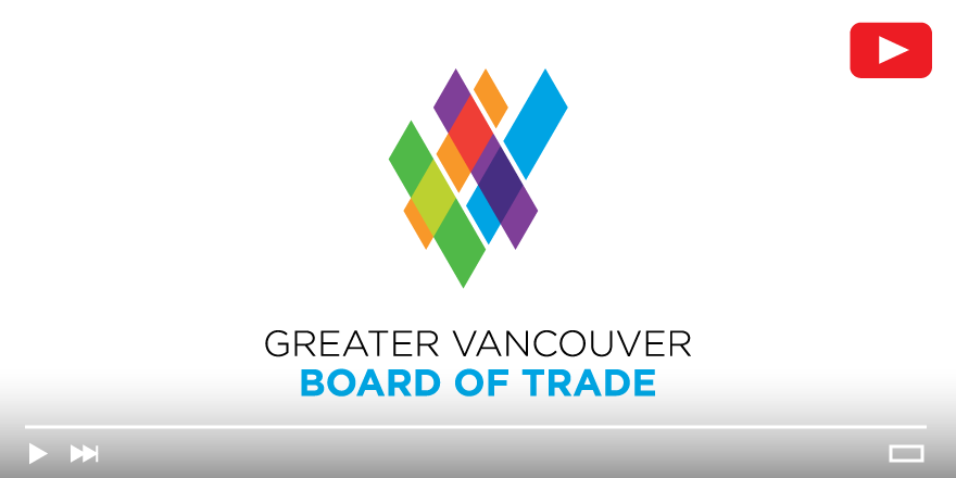
Our new logo, which you will also see above, adopts a more vibrant, dynamic, colourful, and contemporary look, which reflects our momentum, evolution, and forward-looking focus at this point in our history.
Developed by local design firm Myron Creative, the new logo features bold, interwoven lines that form the shape of a "V" — intended to represent the connected and inclusive nature of not just our organization, but the Greater Vancouver business community.
“A sense of strength, energy and confidence is implied,” wrote the graphic designer in a note to our board of directors. “The logo is slightly asymmetric, or on an axis, thus reinforcing a sense of forward motion or a positive outlook on the future. The typography is clear, precise, measured and very approachable.”
Overall, our new logo represents a 21st century organization that is ambitious, progressive, and inclusive. We are very excited to introduce this fresh new “look and feel” because it better reflects the public policy and advocacy work that we do in the region, our fundamental belief in the power of collaboration, and the diversity of our thousands of Members across Greater Vancouver.
Tim Manning is 2015-16 Chair of the Greater Vancouver Board of Trade. He also serves as Regional Vice President, Commercial Financial Services at RBC Royal Bank.
